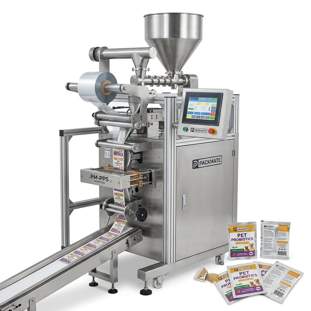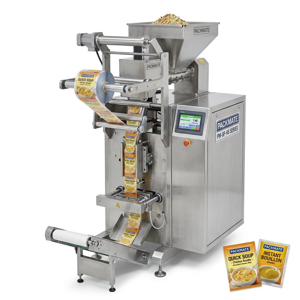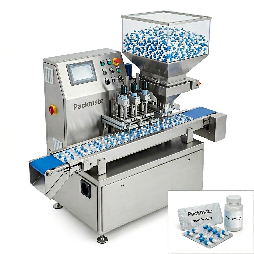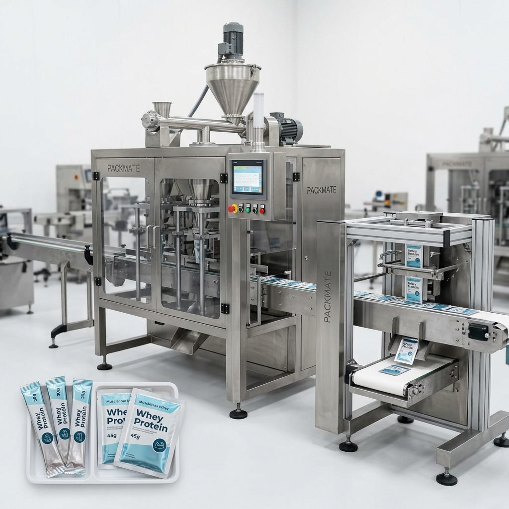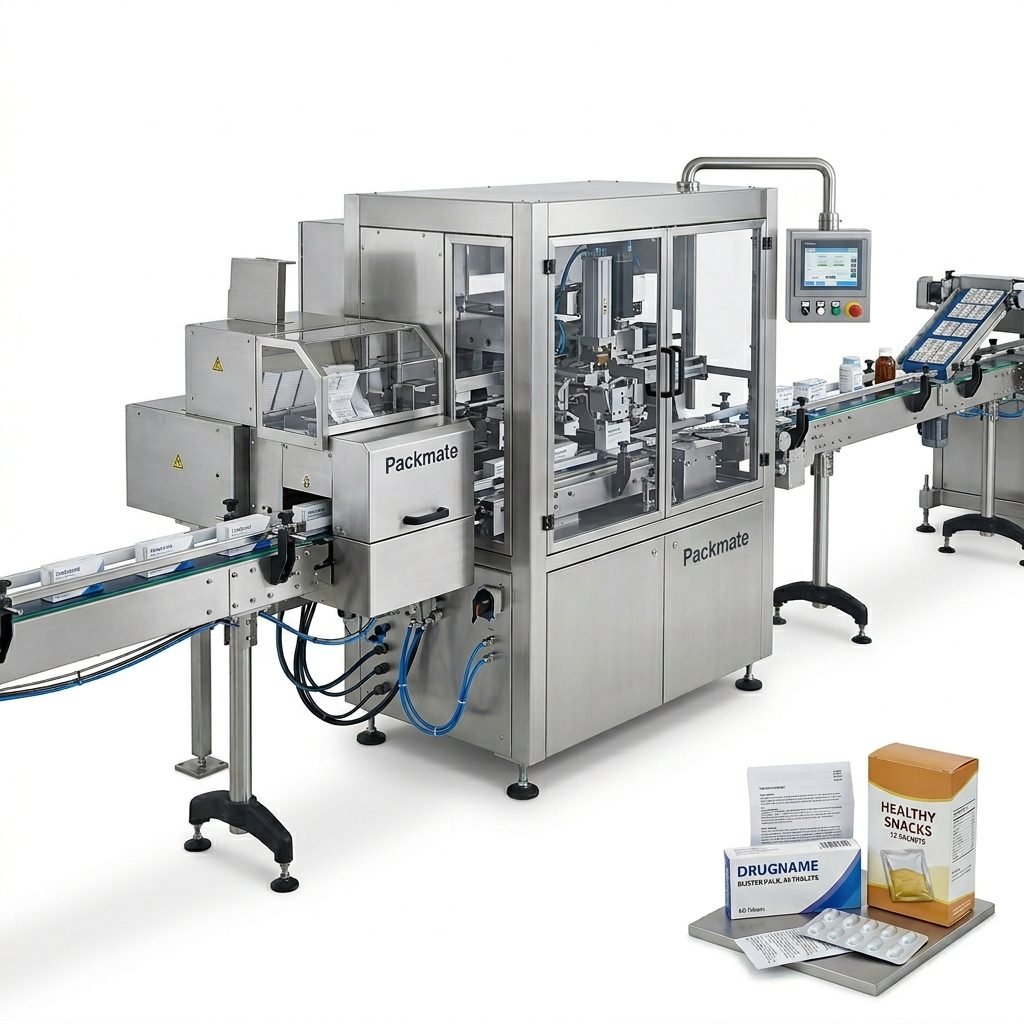
In the fast-paced, highly regulated worlds of food and pharmaceutical manufacturing, communication must be instant, unambiguous, and universally understood. This is where packaging line icons come into play. These simple graphical symbols are the silent language of the factory floor, conveying critical instructions, warnings, and information at a glance. For professionals managing or operating a packaging line, understanding this visual vocabulary is not just beneficial—it’s essential for safety, efficiency, and compliance.
The Critical Role of Icons in Packaging Systems
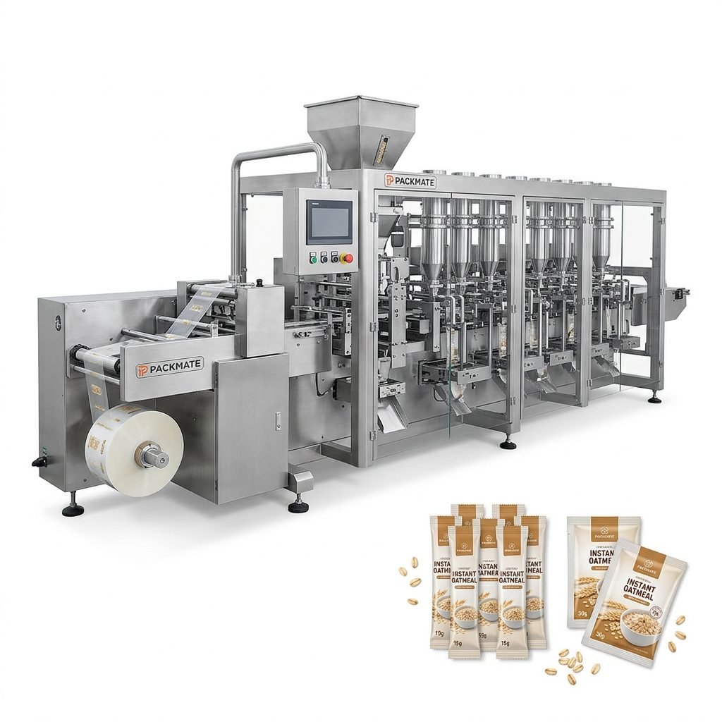
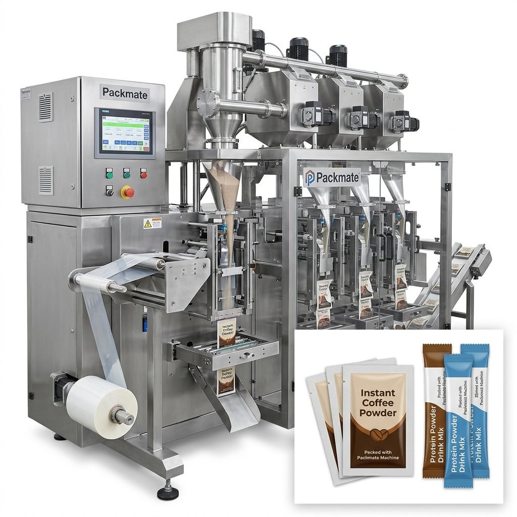
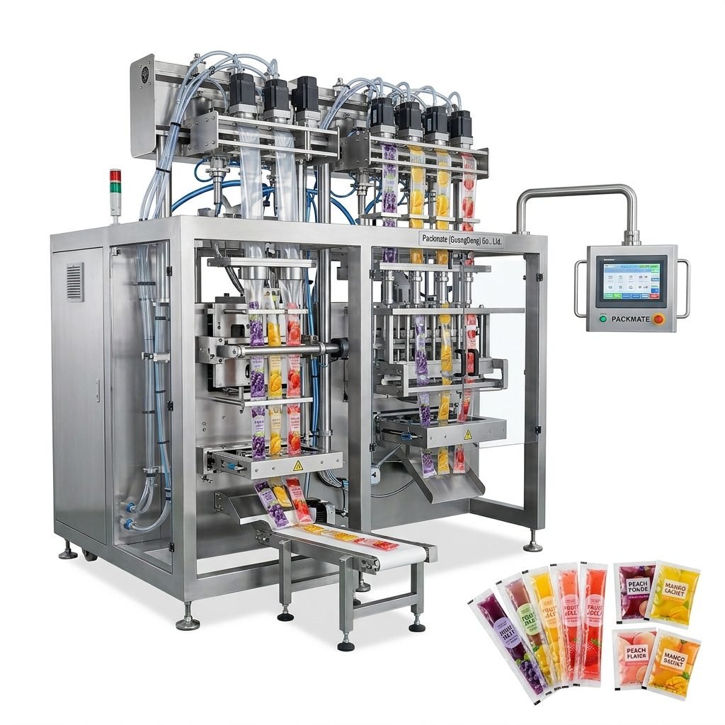
Before diving into specific symbols, it’s important to grasp why icons are so vital. In environments where operators may be managing high-speed machinery like a multi-lane stick pack machine or a liquid filling line, text-based instructions can be missed or misinterpreted, especially under pressure or in noisy conditions. Icons transcend language barriers, making them indispensable in global operations. They standardize procedures, reduce training time, and are a cornerstone of lean manufacturing and 5S methodology, helping to maintain an organized and error-free workspace.
Key Insight: A well-designed icon system on a packaging line acts as a continuous, silent trainer and guide, reducing cognitive load on operators and minimizing the risk of human error during critical processes.
Decoding Common Packaging Line Icons: A Visual Glossary
Let’s explore some of the most frequently encountered icons on food and pharma packaging lines and decode their universal meanings.
1. Safety & Hazard Icons
These are non-negotiable and are often governed by international standards (like ISO 7010).
- ⚠️ Warning / General Hazard: A yellow triangle with an exclamation point. Indicates a potential risk that requires caution.
- ☣️ Biohazard: Crucial in pharmaceutical packaging for areas handling potent compounds or waste.
- 📛 High Voltage / ⚡ Electrical Hazard: Found on control panels, motors, and electrical enclosures.
- 🔥 Hot Surface: Used on sealing jaws, heat tunnels, and sterilizers.
- 👁️ Eye Protection Required / 👂 Hearing Protection Required: Mandatory PPE zones.
2. Operational & Process Control Icons
These icons guide the daily operation and setup of the machinery.
- ▶️ Start / ► Run: Often green, indicating the initiation of a machine cycle or line.
- ⏸️ Pause / ⏹️ Stop: Yellow for pause, red for emergency or full stop. The stop button is typically the largest and most prominent.
- 🔄 Reset / ↺ Clear Jam: Instructs the operator on how to reset a fault or clear a product jam.
- ⚙️ Settings / Adjust: Points to adjustment points for parameters like fill volume, seal temperature, or label position.
- 📊 Check Weight / ✅ Quality Check: Indicates inspection points for checkweighers, vision systems, or manual QC stations.
3. Material & Logistics Icons
These ensure smooth material flow and inventory management, critical for lines handling everything from food granules to pharmaceutical powders.
- 📦 Load Film / 🧵 Load Labels: Shows the location to replenish packaging materials.
- ⬇️ Feed Product / ⬆️ Unload Finished Goods: Guides the input of raw product and output of packaged units.
- ♻️ Reject Bin / ❌ Defective Product: Clearly marks the location for automatically or manually rejected items.
Design Best Practices for Effective Packaging Line Icons
An icon is only as good as its design. Poorly designed symbols can create more confusion than they resolve. Here are the golden rules for creating or selecting icons for your packaging system.
Simplicity is Paramount
Avoid excessive detail. The icon must be recognizable from a distance and when viewed quickly. Use clear, bold shapes. Think of the universal power symbol (⏻)—it’s a circle and a line, instantly understood worldwide.
Consistency Across the Line
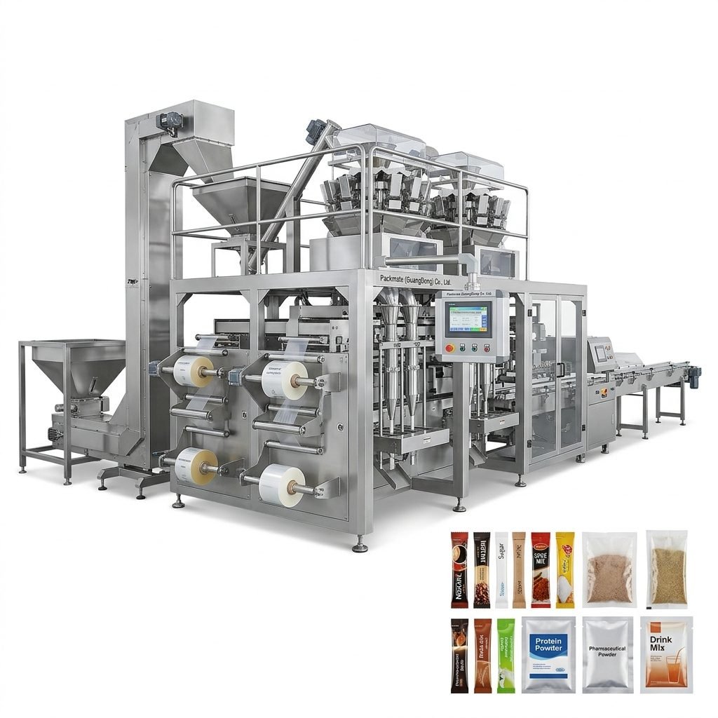
All icons on a single packaging line or across a factory should follow the same visual style: similar line weight, color palette, and level of detail. This creates a cohesive visual language. Companies like Packmate (GuangDong) Co., Ltd. understand this, integrating clear iconography into their control panels and machine interfaces as part of a complete, user-friendly solution.
Use Color Strategically (But Don’t Rely on It)
Color reinforces meaning: Red for stop/danger, Green for go/start, Yellow/Amber for caution. However, always ensure the icon is still comprehensible in grayscale for color-blind operators.
Combine with Text for Clarity
Especially for less common or machine-specific functions, pairing an icon with a concise text label (e.g., “Jog Mode,” “Purge”) eliminates all ambiguity. This is a best practice seen in professional packaging line case studies from industry leaders.
Application in Food vs. Pharmaceutical Packaging Systems
While the core iconography is similar, the emphasis and regulatory context differ between these two sectors.
Food Packaging Lines
Focus here is on hygiene, allergen control, and operational efficiency. Icons are heavily used for:
- Clean-In-Place (CIP) / Washdown: Icons indicating zones for cleaning, often with symbols for water and spray.
- Allergen Warning: Specific icons or color-coded tools/labels for lines processing nuts, dairy, gluten, etc., to prevent cross-contamination.
- Temperature Zones: Icons indicating chilled, ambient, or hot filling areas.
Pharmaceutical Packaging Lines
Here, the stakes are even higher, with a paramount focus on product integrity, sterility, and regulatory traceability (e.g., FDA, EU GMP). Icon use is critical for:
- Grade A/B/C/D Cleanroom Zones: Distinct icons or signage marking transitions between different cleanliness-level environments.
- Material & Personnel Flow: Arrows and directional icons to enforce unidirectional flow and prevent cross-contamination.
- Data Integrity & Checkpoints: Icons for scanning barcodes, performing in-process checks, and documenting actions, which are vital for audit trails. A reliable partner like Packmate designs lines with these regulatory needs in mind.
Implementing a robust visual system with icons is a strategic investment. It streamlines operations, enhances safety, ensures compliance, and ultimately protects your brand by reducing errors. Whether you are designing a new line or optimizing an existing one, applying these principles of icon meaning and design will yield significant returns. For more insights into integrated packaging solutions, explore our comprehensive professional services.
Frequently Asked Questions (FAQs)
1. Are there international standards for packaging machine icons?
Yes. The primary standard is ISO 7010 for safety signs (hazard, fire, emergency, mandatory action). For other operational icons, while there is no single global standard, best practices from ISO 3864 (safety colors and signs) and common industry conventions are widely followed to ensure consistency and understanding.
2. Can we use custom icons on our packaging line?
Absolutely, for non-safety functions. For machine-specific processes (e.g., a unique calibration mode), a well-designed custom icon paired with a label is effective. However, for safety-related functions (stop, emergency off, hazard warnings), you must use the standardized, legally required symbols.
3. How do we train operators on a new icon system?
Incorporate the icons into your Standard Operating Procedures (SOPs) and training manuals. Use the “icon + text” combination during initial training. Consider creating a simple visual glossary or legend posted near the line control panel as a quick reference, much like the clear documentation provided in a machine catalog.
4. What’s the biggest mistake companies make with line icons?
The most common mistake is inconsistency—using different styles, colors, or meanings for the same action across different machines on the same line. This forces operators to “re-learn” the interface for each machine, increasing cognitive load and error risk. A unified visual language is key.
5. Do icons replace the need for written procedures?
No, they complement them. Icons provide at-a-glance guidance and reminders on the line itself. Detailed written SOPs are still necessary for comprehensive training, troubleshooting, and ensuring compliance with quality management systems (like ISO 9001 or GMP). Icons are the quick-reference guide, while SOPs are the full manual.